3 Web Design Myths Debunked!
When it comes to web design, the information can be overwhelming. Don’t let it get you down. We’ll debunk some of the biggest web design myths out there, so you can get on the right track with your online vision.

If you eat before swimming, you need to wait 30 minutes before making a splash, or else you’ll experience serious cramps.
We’ve all heard this advice growing up as kids, probably from our parents. But, it’s also common knowledge that this is totally a falsehood, a fallacy... a MYTH!
Myths persist, especially on the internet. If everyone else is doing it, why shouldn’t you? The fact is, you need to do your own research on any subject. With promoting your business online, there are so many tips out there that can lead you astray, but how do you know a tip won’t be successful for you?
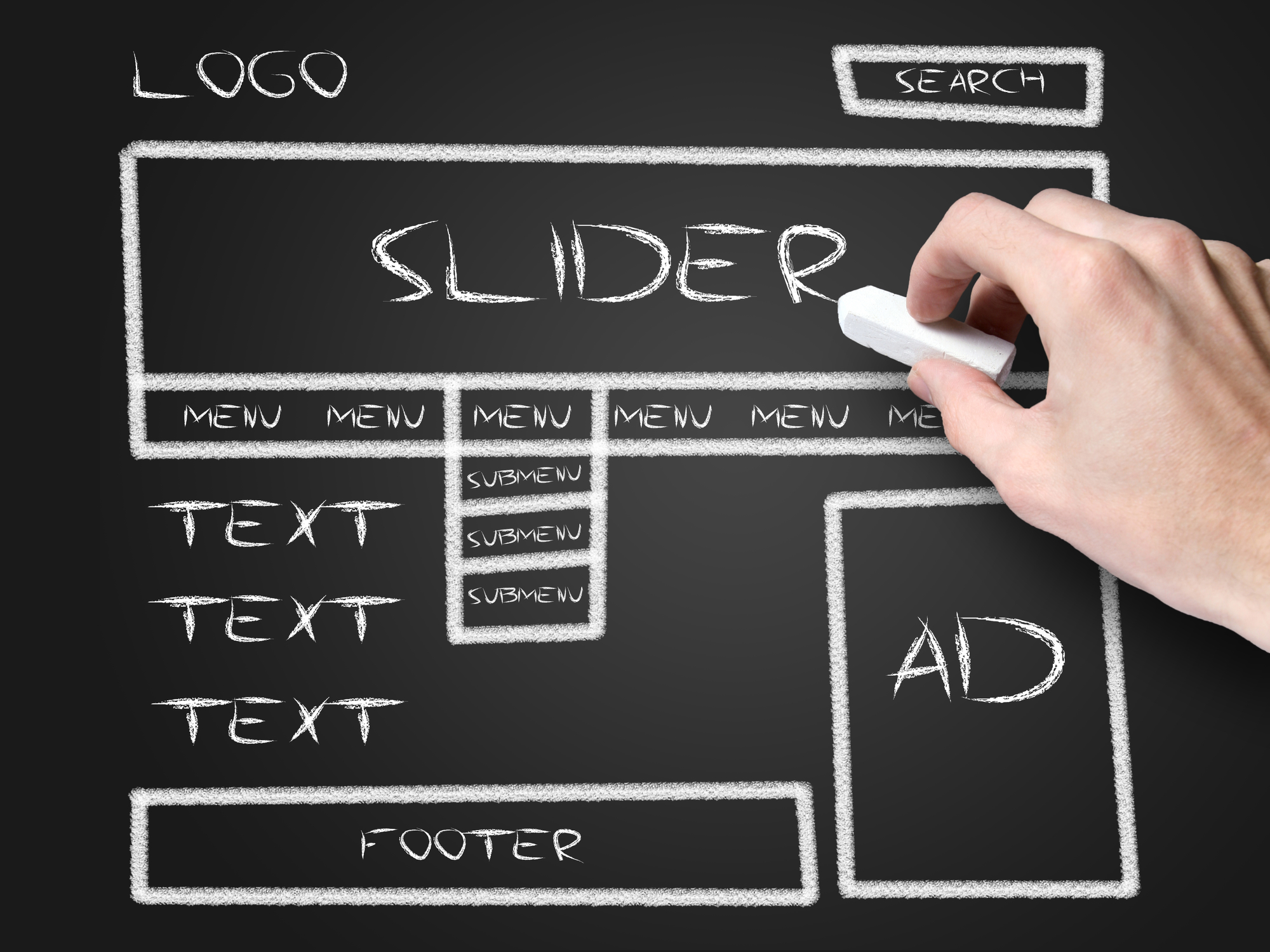
When it comes to web design, the information can be overwhelming. Don’t let it get you down. We’ll debunk some of the biggest web design myths out there, so you can get on the right track with your online vision.
Myth #1: Keep the call to action (CTA) up top
Meaning, it was always stated that the CTA should stay above the fold, because visitors didn’t have the attention span to make it to the bottom of the page to click on to glory. The truth is, you don’t have to stick to this rule. CTA’s have been proven to perform just as well-top or bottom- it just depends on the design layout. So, if you want to place the CTA below the fold, give it a shot!
Myth #2: The most important part of a website is the homepage
Let’s be honest, most of us click onto a website from an ad or a blog, but we don’t go straight to the homepage. In fact, most of the time, when we visit websites, we may never even see it. Don’t put all of your creative energy into the homepage . Instead, focus on having a consistent design layout from start to finish.
Myth #3: Design with the sale in mind
Giant text, flashy buttons, huge graphics...this is what you see on a website centered on the sale. Forget it! A successful business website doesn’t need to be sale-centered. Make it easy to navigate, tasteful and designed towards creating value. Isn’t that more trustworthy than in-your-face buttons that seem like they just want to get you to click immediately?
Related posts

Why Good Design Alone Won’t Convert (And What Actually Does)
If your website isn’t converting, the issue usually isn’t how it looks—it’s how it functions, communicates, and guides users. Let’s take a closer look.

Why Your Website Is Your Most Important Sales Tool
Your website isn’t just a digital placeholder—it’s your most powerful sales tool.

The Biggest Technology Mistakes Jacksonville Small Businesses Make
By identifying common technology mistakes early, businesses can build stronger systems that support efficiency, security, and customer engagement. Here’s our list of the most common mistakes to look out for, and how to best navigate them.